Skillbuilding + Practica Assignments (30% of final grade)
Summary
These assignments are intended to fulfill the course goal:
- Evaluate and critically assess digital methodologies and tools through hands-on technical experimentation and skillbuilding
I want you to gain practical DH experience in this class. I also recognize that you may be more interested in some topics than others. We’ll walk through some methods and tools together in class, during our “lab.” If a topic interests you, you can choose to demonstrate your understanding beyond the classroom with a practicum assignment. Each of these practica will be worth 10% 15% of your grade. You will complete 3 2 of them, for a total of 30%.
Rubric
A – Successful achievement/creation of (all of the) intended end-product(s) of an assignment OR a critical assessment of why it didn’t turn out the way you intended. Substantive reflection on the process, tools used, data/sources involved, and result. Insight into how this experience can be applied in the future. Sought guidance from classmates and instructor via group email or in-class lab if difficulties or confusion arose while working on the assignment.
B – Successful achievement/creation of only part of the intended end-product(s) of an assignment, little assessment of why it didn’t turn out the way you intended. Substantive reflection on the process, tools used, data/sources involved, and result. Insight into how this experience can be applied in the future. Sought some guidance from classmates and instructor via group email or in-class lab if difficulties or confusion arose while working on the assignment, but did not follow through.
C – Successful achievement/creation of only part of the intended end-product(s) of an assignment, no critical assessment of why it didn’t turn out the way you intended. Surface-level reflection on either the process, tools used, data/sources involved, or result. Minimal insight into how this experience can be applied in the future. Did not seek guidance from classmates and instructor via group email or in-class lab if difficulties or confusion arose while working on the assignment.
Revise & Resubmit–No evidence of any of the above criteria. I will ask you to revise and resubmit the assignment.
Possible Assignments
Textual Analysis
Choose a tool:
🌶 Distant Reader, Constellate, or HathiTrust Research Center
🌶🌶 MALLET and the Topic Modeling Tool GUI, AntConc, or NLTK
- Pick a corpus or corpora
- Install or load tools as necessary
- Explore your results!
- Answer the following questions and post them in the “text entry” box of this assignment: Where did your data come from? Why did you choose to analyze it with this method? What did you want to find out from the data? What did you actually find out? What would you do differently next time? [Insert any other insights, too]
- Take a screenshot or copy the link to your results and submit that to this assignment.
Due on or before 4PM, November 22.
Data visualization
🌶 Interactive Timeline with TimelineJS
Timelines are a tried-and-true tool for historians to show change over time. Although they have limitations – in particular, a strict linearity that may suggest causation – they can be a useful teaching/learning tool or way to add temporal context to a complex or unfamiliar set of events. TimelineJS is a free, browser-based app created by the folks at Knight Lab at Northwestern University that creates interactive, multimodal timelines that can be embedded into web pages.
To complete this assignment:
1. Copy the template Google Sheet and populate the rows with events and images, links, videos, or other media that you’d like to display (for this assignment, include a minimum of ten events).
2. Following the instructions in the Knight Lab site walkthrough for steps 2 and 3, “publish” your template spreadsheet to the web and paste it into the form to generate your timeline.
3. Edit or adjust as needed, and title the timeline.
4. Answer the following questions and post them in the “text entry” box of this assignment:
Where did your data come from? Why did you choose to analyze it with this method? For what applications might you use this tool or others like it?
5. Submit the link generated in step 4 of the Knight Lab walkthrough to this assignment.
Finished product example:
Mapping A World of Cities made by the Leventhal Map and Education Center at the Boston Public Library
Embedded about halfway into this CNN article: https://www.cnn.com/2016/04/20/asia/north-korea-restaurant-defectors/index.html
Video walkthrough: (Via Knight Lab)
Due on or before 4PM, November 22.
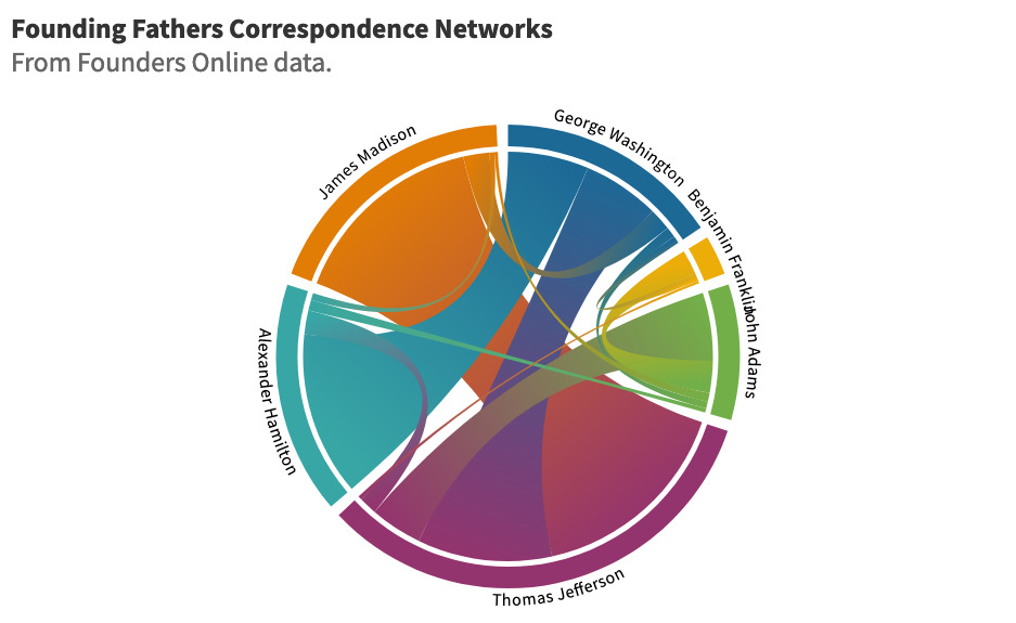
🌶 🌶 Network visualization (chord diagram) with Flourish
Network visualizations show connections and interrelationships between entities. A visually-interesting way to represent a small dataset containing this kind of information is with a chord diagram (larger or very complex datasets are better represented with a network diagram). We’ll be using a free tool called Flourish to make an interactive visualization of this kind; in the walkthrough video below, I’ll be using information about correspondence between some of the Founding Fathers.
To complete this assignment:
1. Find or create a CSV file in Excel, Google Sheets, or LibreOffice Calc amenable to interpretation in this way. (See the video below for help making this dataset).
2. Upload this CSV into the Flourish interface using the Chord Diagram template, add a title, and make any cosmetic changes you wish.
3. Publish and/or export the finished product as an HTML file, image file, or embeddable link.
4. Answer the following questions and include them in the text entry box below:
Where did your data come from? Why did you choose to analyze it with this method? What did you want to find out from the data? What did you actually find out? What would you do differently next time?
5. Submit your exported visualization to this assignment.
Finished product example:
Due on or before 4PM, November 22.
🌶 🌶 Racing bar/column graph with Flourish
Sometimes you just have to show a comparison in your data. Bar and column charts are a great option for visualizing proportional, categorical relationships. They’re relatively simple, but can be very effective. A newer and more visually-interesting way to represent a small-to-medium dataset containing this kind of information is the “racing” bar chart (also called a bar chart race) that dynamically shows comparisons with the added axis of change over time. We’ll be using a free tool called Flourish to make a visualization of this kind; in the walkthrough video below, I’ll be using data from the Social Security Administration about the most common names listed on Social Security Applications, organized by date of birth.
To complete this assignment:
1. Find or create a CSV file in Excel, Google Sheets, or LibreOffice Calc amenable to interpretation in this way. (See the video below for help making this dataset.) You must have a spreadsheet structure that resembles this:
| **Title conveying contents of column | **Optional category markers | **One event/time-based comparison e.g. 1994 Olympic Games | ** A second event/time-based comparison e.g. 1998 Olympic Games | **Optional other event/time-based comparisons —> e.g. 2002 Olympic Games |
| Rows containing at least two things to be compared over time (like people, places, things) e.g. Italy [name of country] | e.g. Basketball [Category name] | Quantitative value to be compared e.g. 10 [number of gold medals] | Quantitative value to be compared e.g. 15 [number of gold medals] | Quantitative value to be compared e.g. 18 [number of gold medals] |
| e.g. Indonesia [name of country] | e.g. Tennis [Category name] | e.g. 4 [number of gold medals] | e.g. 2 [number of gold medals] | e.g. 7 [number of gold medals] |
2. Upload this CSV into the Flourish interface using the Bar Chart Race template, add a title, and make any cosmetic changes you wish.
3. Publish and/or export the finished product as an HTML file, image file, or embeddable link.
4. Answer the following questions and include them in the text entry box below:
Where did your data come from? Why did you choose to analyze it with this method? What did you want to find out from the data? What did you actually find out? What would you do differently next time?
5. Submit your exported visualization to this assignment.
Finished product example:
Due on or before 4PM, November 22.
🌶🌶 Advanced Networks with Gephi
Due on or before 4PM, November 22.
Mapping
🌶 Mapping with Google MyMaps
Google MyMaps is a browser-based location mapping tool built on the GoogleMaps API. It’s not as flashy as some other mapping tools, but it is relatively easy to use as well as to share and embed the finished product. This makes it ideal not only for spatial organization in your research process, but for creating a quick, shareable web map for teaching or interpretation purposes.
Preparation: You can make maps with Google MyMaps in two ways. You can manually search for and add points, or you can do that work ahead of time in a CSV (spreadsheet) and import it into the web interface. If you want to go the latter route, make sure that your data is structured like so:
| **Title conveying what’s in the column | **Title conveying what’s in the column (e.g. Photo) | **Title conveying what’s in the column (e.g. Place descriptor) | **Title conveying what’s in the column (e.g. Text blurb) |
| Latitude/longitude OR Address OR Place names (e.g. Genoa, Italy) | (This column not required) | (This column not required) | (This column not required) |
The only required column is the one with location information, but you can add as many as you like.
To complete this assignment:
1. Sign into MyMaps with your Google account and create a map. In the map legend, choose the “Base map” that you would prefer.
2. Gather a list of at least eight points of interest that you want to map.
3. Enter the information into a CSV (Google Sheets is recommended, and it can import directly into MyMaps). Import it as a map layer by choosing “Add layer” in the map legend, and “Import.”
OR
3. Add the points manually. Layers can help you sort the points if you want (categories like “historic sites,” “historic parks,” and “museums” might be helpful).
4. Change anything you might need to. You can draw lines and shapes if you want, customize colors, and pick an icon to represent your point.
5. Answer the following questions and post them in the “text entry” box of this assignment:
Where did your data come from? Why did you choose to analyze it with this method? What did you want to find out from the data? What did you actually find out? How accurate is this representation of place/space? What would you do differently next time? [Insert any other insights, too]
6. In the top center of the map legend, click the “Share” icon to generate a link to your new map. Submit that URL to this assignment.
Finished product example:
A map of areas visited in Italy by Dr. Victor Heiser in 1918, to embed into a blog post about the trip.
Video overview:
Due on or before 4PM, November 22.
🌶🌶 Interactive chloropleth/heat map with Mapbox
Due on or before 4PM, November 22.
Storytelling
🌶 Oral history with Story Corps
StoryCorps is a long-running non-profit oral history/storytelling initiative; you may have seen one of their pop-up recording booths or heard one of their segments on your local NPR station. One of their most popular initiatives is the Great Thanksgiving Listen, “a national movement that empowers young people—and people of all ages—to create an oral history of the contemporary United States by recording an interview with an elder, mentor, friend, or someone they admire.” The organization has also developed an app for iOS and Android devices and a web-based platform called StoryCorps Connect that aim to make it easier for anyone to record, share, and preserve interviews and oral histories.
Preparation:
The interview process itself will only require about 5-40 minutes. Most of the work comes beforehand, as you decide on a person in your life to speak with, prepare questions, practice using the app or the virtual platform, and set up the interview itself.
Some resources and prompts you might find useful during each of these steps:
Identifying someone to interview
Who is one person in your life you would like to learn more about?
Who in your life might find this type of recording meaningful?
What stories or memories are important for you to preserve at this time?
Interviews can be recorded locally using the StoryCorps app or in the virtual world with the StoryCorps Connect platform.
Preparing questions
The StoryCorps app features a “Great Questions” generator to help you pick a topic. Or, check out the Interview Planning sheet, the Great Questions List, some Conversation Tips, or browse through the Stories archive to get some inspiration. People get through an average of six questions during a 40-minute interview, so pick 6-8 questions to have prepared.
Practice using the app or virtual platform
This may require a little bit of time and patience to coordinate, depending on your interviewee’s level of comfort using technology, reliable internet and computer access, or other factors.
If recording virtually with StoryCorps Connect, you may wish to walk through the Getting Started Guide by yourself or along with your interviewee.
A similar User Guide also exists for the StoryCorp App, if you will be making your recording in person.
Setting up the interview
Take some time not only to prepare your questions, but also to prepare your interviewee for the questions you may plan to ask. To familiarize your subject with the project, you might share resources such as the following:
Informational resources like “Make History with StoryCorps” and “Recipes for Success on Interview Day”
A list of a few of the questions you are likely to ask, and the interviewee’s consent to be recorded
Clips of classic StoryCorps interviews like “Clean Streets” or “The Temple of Knowledge”
A brief TEDTalk about the first Great Thanksgiving Listen:
To complete this assignment:
1. Prepare for your interview following the prompts above, and set up either the StoryCorps App or a StoryCorps Connect account. Perform at least one test run recording and upload it to the site to make sure it’s working.
2. Interview day! Remember to Practice Active Listening and keep these Interview Tips in mind.
3. If you and your interviewee so choose, you can upload the recording to be preserved in the American Folklife Center of the Library of Congress.
4. Once you’ve conducted your interview, apply keywords and assign it a title and summary.
5. Debrief by answering the following questions and posting them in the “text entry” box of this assignment:
What was your experience as interviewer: did you encounter any challenges, either with the process, the tech, or the conversation itself? What would you do differently or the same next time? What makes an interview different from a text as a historical reference? Do you think your end product is or could be data?
5. If you are comfortable sharing your completed and uploaded interview, please do so in the URL submission space.
If you are not comfortable sharing the recorded interview, transcribe a question and response you received that you found enlightening, surprising, or meaningful and submit it via the text entry box.
Due on or before 4PM, November 22.
🌶🌶🌶 Interactive, non-linear storytelling with Twine
Twine provides a user-friendly way to create your own interactive digital stories. It takes some practice to maneuver in the interface, requires you to download software onto your computer, and incorporates some (optional) references to languages/scripts used in web design like HTML, CSS, and JavaScript. For these reasons, I’ve deemed it 🌶🌶🌶 and provided a number of tutorials and resources to help you as you learn to use this tool.
Preparation:
Download the software from twinery.org and install it onto your computer. It’s compatible with Windows, MacOS, and Linux. The most current version is 2.3.15 – make sure any tutorials you follow or software you download refers to Twine version 2.0+!
Approach this assignment with some idea of the type of story you’d like to tell. Your finished product may be fictional, non-fictional, or a blend of the two; visualizing branching paths of historical contingency can be a huge ordeal, and it may be similar or less overwhelming for you to use a fictional idea, or re-write an existing narrative.
To complete this assignment:
Your completed Twine story should contain, at a minimum:
- 3 images
- Colored text
- A background image
- 2 endings
- 20 passages
You will download the HTML file that Twine produces and upload it to the Canvas assignment.
Some tutorials to aid you along the way:
Rewriting an existing narrative in Twine
Introductory slideshow tutorial + accompanying video [transcript] from Cathy Qiu of San Diego State University
Creating a brand-new story in Twine
Step-by-Step Guide to Twine (in Twine) by Jared Zeiders
Twine 101: Creating Your First Project by Kristen Herr, an in-depth tutorial with lots of real examples
A Quick Twine (2.2+) Tutorial by Allison Parrish, with “milestone” exercises
A Total Beginner’s Guide to Twine 2.1 by Adam Hammond of the University of Toronto
Brainstorming
Storytelling in Twine: Processes and Prompts for Inspiration by Tina Lumbis
Branching + conditional statements/contingency
Conditionals slideshow tutorial + accompanying video [transcript] from Cathy Qiu of San Diego State University
Styling your Twine
Stylizing Your Twine Story tutorial from Cathy Qiu of San Diego State University
Twine 2 Beginners Tutorial Series on YouTube
Due on or before 4PM, November 22.
Interactives/Exhibits
🌶🌶 Interactive tour with Clio
Clio is a nonprofit educational website and mobile application that provides a straightforward interface for creating and editing points (and collections of points, in tours) of historical/cultural interest and making them accessible to the public to explore IRL. It has a number of other useful features, including robust support for use in the classroom and at an institutional level, for historic sites, museums, etc. A few options are reserved for the institutional-type accounts; for instance, you can’t make a virtual tour of several rooms in one museum if you aren’t working with an institutional account. You can, however, create entries and tours for:
- HISTORIC SITES, MONUMENTS, LANDMARKS, AND PUBLIC ART
Physical sites that exist in the present. These entries guide the public to an existing monument,
historical marker, landmark, building, or public space. The entry will offer a concise historical
interpretation of the site and its significance. - MUSEUMS, GALLERIES, AND ARCHIVES
Historical and cultural institutions. Entries should provide a history of this institution and, if the
building/location is historic, a history of the building/location as well. - TIME CAPSULE
Time capsule entries explore past places and past events. For structures that no longer exist, the
entry should be pinned to the specific (or approximate) location of the place, and the construction
and demolition dates in parentheses after entry name in the title. For past events, the entry
should be pinned to where the event took place.
You’re going to create (and if it’s close by enough, test out!) a walking or driving tour to access through the Clio app on iOS or Android devices.
Preparation: Come up with an idea for such a tour that would contain at least five points of interest. Don’t know where to start? Here are a few ideas:
- You might choose to map the route of the “Children’s Crusade/March of the Mill Children” led by “Mother” Jones in 1903.
- You could create entries for some of the major Fairmount Park landmarks of the 1876 Centennial Exposition in Philadelphia following this contemporary map and guidebook.
- Philly has a rich music history and lots of recording industry hotspots you could highlight.
(N.B. Your spots don’t need to have any connection to Philadelphia)
To complete this assignment:
1. Log into the Clio website via the “Clio in the Classroom” account I’ve set up for our use (Message me for the password!)
2. Take some time to browse through points of interest that have already been added, and decide if you will need to create new entries or edit existing entries in order to build the tour theme you’re interested in.
3. An entry in Clio is made up of several parts:
- An Overview (1 paragraph) that offers an objective, descriptive, and compelling overview that helps the reader understand the history and significance of my topic.
- A Backstory (4-6 paragraphs) that offers readers a historically accurate and detailed narrative on my topic.
- Images with captions
- Sources
- Links
You can create a new entry by clicking the green + “Create new entry” button on the left side menu. You don’t have to create all of your five entries; feel free to use ones that have already been created. Additionally, because we have a classroom account, you will have access to edit pre-existing entries in Clio.
4. Once you’ve made/found/edited a good set of entries, it’s time to make the tour! To do this, navigate to the green + “Create new tour” button on the left side menu. You’ll be prompted to choose between three types of tours: Walking Tour, Driving/Biking Tour, or Thematic Tour/Heritage Trail, with examples of each kind of tour. Go ahead and pick whichever you like.
5. From there, add the sites you’re interested in highlighting to your map. You can drag and drop the entries to change their order. Once you’re finished, click the green “Save your tour” button, and I’ll be notified that you’ve submitted it.
6. Answer the following questions and post them in the “text entry” box of this assignment:
Where did your data/source material come from? Why did you choose to analyze/interpret it with this method? How accurate is this representation of place/space? For what applications might you use this tool or others like it?
(Optional) Test it out (if that’s realistic). Each tour is assigned its own URL, so you can share with others or access it through your own mobile device.
Video overview:
The Clio site has a bunch of solid tutorial videos available, and I recommend taking a gander at them if you get stuck.
Due on or before 4PM, November 22.
User Testing the “In Her Own Right Project” website
The In Her Own Right: A Century of Women’s Activism, 1820 – 1920 project began in 2016 as an inter-institutional effort by PACSCL to bring together and highlight archival collections items from local repositories that reveal stories of women’s activism. The site will be undergoing user testing at the end of October, 2021, and you’re invited to contribute to the process as a practicum assignment.
To complete this assignment:
You’ll receive a survey with questions to answer after browsing the InHOR page and submit your response to organizers in order to help them gauge the site’s navigability, aesthetics, accessibility, content, and structure. Then, provide a brief (250 word maximum) reflection on your experience with the process of user testing, what you may have learned or discovered, and how these insights might inform digital projects of your own making. Submit your answer in the “text entry” box of the assignment.
Notify me if you’d like to participate in this survey by October 18th. Due on or before 4PM, November 22.
Data Management
🌶 Setting up a citation/data management system with Zotero or Tropy
Zotero and Tropy are software tools developed especially for researchers by the Roy Rosenzweig Center for History and New Media at George Mason University. These are very handy, especially for graduate students and researchers who often struggle to organize and handle hundreds or thousands of articles, monographs, web resources, archival materials, and more that they need for research. Zotero is a “citation manager” and Tropy calls itself a “research photo manager.” They can be used in conjunction or on their own. I’ll walk through each of them, but it’s up to you whether you choose to use one or both for the assignment.
Preparation:
Zotero requires that you have a collection of published sources (NOT manuscripts or other archival materials). Good examples might be your comps list, or a group of articles to read for a class (or really anything; the sky’s the limit). It doesn’t matter whether these sources are already on your computer or sitting on your desk, because we can enter their information in both ways. Download Zotero to your computer. Navigate to Zotero walkthrough.
Tropy is really good at handling large amounts of archival material that doesn’t fit very well into Zotero or really any other data management systems. Whether you have a collection of photos you’ve taken of archival documents stored on your phone, a neatly sorted series of digital file folders, or just the contents of a finding aid in front of you, Tropy will help you manage those sources. Download Tropy to your computer. Navigate to Tropy walkthrough.
To complete this assignment:
Zotero
1. After you’ve downloaded and installed the software, create a new project by choosing “New Collection” in the File dropdown menu, and name it.
2. Add items into your collection; you’ll want a total of eight or more for the purposes of this assignment. There are several ways to do this:
You can manually add items by click the green New Item button on the toolbar, and choosing the type of document it is. When your item is created, you’ll need to type its identifying information like title and publication date (metadata) into the menu on the right. You can also add notes about the source, assign keyword tags to sort them later, or connect other related documents in the window.
If you have a DOI (Digital Object Identifier), ISBN number, or PubMed ID, Zotero will add the metadata for you automatically. Click the magic wand button on the toolbar to add an item in this way.
Zotero Connector is a free browser extension for Safari, Chrome, and Firefox that allows you to add items directly from the web. (This function doesn’t always work perfectly but it speeds up the process.)
3. You can attach files to objects for easy access. Click the paperclip button on the toolbar to attach a document like a website or PDF to one of your items.
4. It’s easy to sort your sources in Zotero. You can also create subcollections if needed. For now, though, sort the library by Year, ascending (meaning oldest first) by clicking on the Year column.
5. Answer the following questions and post them in the “text entry” box of this assignment:
Where did your data come from? Why did you choose to arrange it with this method? For what applications might you use this tool or others like it? Are there cons to using categorical tools like this one?
6. From Zotero, you can export your library as a spreadsheet (CSV), create a contents report, or generate a bibliography by right-clicking on the collection folder and making your choice. Download this file and turn it in to this assignment.
(Optional) You can also create group libraries to share and crowdsource references online. You’ll need to create an account to do that, but if you choose to, please share the URL with the class! Another bonus to creating an account is that you can access your synched Zotero library from any computer.
Finished product example:
A group library themed around “Consent, Design, and Archives“
Video Walkthrough Playlist (via McGill University):
Tropy
1. Once you’ve downloaded and installed the software, select “Create New > Project” in the File dropdown menu, and name it.
2. Tropy will prompt you to drag and drop your research photos or scans. If you don’t have any, you can add items manually by selecting “Create New > Item” in the File dropdown menu. Add at least eight items for the purposes of this assignment.
3. Once you have some items, you’ll need to add their identifying information like author, creation date, archival repository, box number, and more (metadata) via the right pane. You can choose from templates: Dublin Core (an internationally-recognized metadata standard, or schema), Tropy Correspondence, Tropy Generic, and Tropy Item. You’re not required to, but you can also edit, create, import and export your own metadata templates to suit your individual needs.
4. If you added photos, you can organize them into unique items by dragging and dropping them on top of one another. You can also sort items into categories for easier retrieval by choosing “File > Create New > List” and then dragging the items into the folder in the left pane.
5. If you added photos, you can double-click the thumbnail in the right pane to reach an interface that allows you to zoom in on your photo and enter transcriptions or notes underneath it. These annotations are fully searchable. Add annotations like this to two of your items, if they have photos and you’re able.
6. Answer the following questions:
Where did your data come from? Why did you choose to arrange it with this method? For what applications might you use this tool or others like it? Are there cons to using categorical tools like this one?
7. When you’re finished creating your archive, you can export it by selecting “File > Export > JSON-LD”. This will download a hierarchical representation of all of the metadata you entered into the archive, rendered in JSON, which is based on Javascript. It’s not meant to be human-readable! Upload that file to the assignment anyway.
(Optional) If you implement plugins, you can also export to Omeka S to make a web exhibit, to a CSV, or to a full ZIP file archive of your items.
Video overview (via Tropy):
Due on or before 4PM, November 22.
🌶🌶 Evaluating your data model with Breve Tools
Due on or before 4PM, November 22.
🌶🌶🌶 Encoding audio files for easy navigation with OHMS
Due on or before 4PM, November 22.
Propose Your Own Practicum
Have you identified a tool and/or dataset that you’re interested in exploring? Propose it in the “text entry” box, and we’ll talk about if it’s a good fit for this assignment. If so, you’ll share a brief summary with the class of your process and findings.
After I’ve given the go-ahead –
To complete this assignment:
You don’t need to have completely finished everything you want to do for this project, and that’s ok. Regardless, though, you’ll need to explain it in a nutshell to the class on or before November 29th. This debrief is all you will need to “turn in” for this assignment!
Debrief Grading rubric
Form of debrief:
You can submit this in one of several ways: present to the class live on November 29th, record your debrief (Screencast-O-Matic is great for this) or compose a blog post and send it to myself and your classmates by November 29th.
If you decide to present (live or prerecorded), your presentation shouldn’t last more than 8 minutes. If you opt for the blog post, it should not be fewer than 500 words (no maximum). Be sure to show your work with screenshots, photos, and other visual aids so we can see what you’re talking about!
Content of debrief:
Your debrief should cover the below points.
- Genesis
- What was your initial idea?
- What was your initial idea?
- Process: How did you proceed to turn the idea into a project?
- How did you organize the process? Did you break it into steps?
- What data/content did you use, and where did you get it?
- What tools did you use? How was your experience learning or using those tools?
- What challenges, difficulties, or hurdles did you encounter in the process?
- Did you change your mind, methodology, or tools at any point during the process? If so, why?
- Outcome
What did you find out?- Point to any salient findings
- What advice would you give another person (or, past you) who was about to start a similar project?
- Could you use the skills, data, tools, or methodologies from this project in future scholarship/professional situations?
- What’s the current state of your project?
- Is it finished, or will you continue to work on it?
- What are your next steps? (Hint: if you submit it to a conference or publication, that can serve as your “Reflection” assignment!!)
Due on or before 4PM, November 29.