Lab Assignments
Summary
These assignments are intended to fulfill the course goal:
- Evaluate and critically assess digital methodologies and tools through hands-on technical experimentation and skillbuilding
These assignments will not be graded for content or completion; rather, they will make up a good portion of our class time, and can be worked on individually or as a group. If you must miss class for any reason, you can refer back to these assignments later if you so wish.
Week 3: Crowdsourced history via Zooniverse + LOC: By the People
As we’ll talk a lot about this semester, digitization is not a panacea, and it takes a lot of labor and time to turn a historical document into something that can be easily and quickly used by a researcher online. Scanned items that are printed can be processed with Optical Character Recognition (OCR) software like Abbyy Fine Reader, Adobe Acrobat Pro, or Tesseract OCR in order to create an approximation of what their contents say, which can then be searched, sorted, or edited. Hand-written, torn/damaged, or otherwise non-standardized printed items are much harder to make readable and often require humans to do this work (although HTR software is being developed, it will be a while before it’s very accurate). As you know, many organizations don’t employ people to do this work; instead, they rely on crowdsourced transcription, tagging, editing, and other functions to make the contents of these objects more accessible. Project Zooniverse and the Library of Congress’ By the People are two major initiatives in this vein with simple user interfaces and large, involved communities of volunteers. This can be laudable work when not exploitative of labor, so you’ll be dipping your toes into one of these platforms to get an idea of the amount of work that goes into the process.
To complete this assignment:
1. Browse the open projects at By the People and Project Zooniverse and identify one to which you’d like to contribute. Sign up for an account at the platform of your choice.
2. Take some time to review the platform’s standards and any directions specific to your project; By the People has a welcome guide. Zooniverse’s projects have their own directions and sometimes tutorials to walk through (an example here).
3. Decide ahead of time how many hours you’re going to put into this work! The time can fly by or feel like molasses, so it’s a good idea to have a benchmark before you go in. This work is not always very intellectually-stimulating. Get up and take breaks! Drink some water! I’d like for you to spend at least two hours reviewing how-to information and working on your chosen project for this assignment, but I leave that on the honor system.
4. As you work through this assignment, consider:
What are the pros and cons of crowdsourced data work like these initiatives? Did you learn anything new while working on your project? What can you glean about the project’s standards for ensuring accuracy, consistency, and attribution of labor?
Week 4: Textual analysis with Voyant Tools
Voyant Tools is a browser-based environment for analyzing digital texts. The tools provide a fast and comparatively easy way to look at a text or a corpus (collection, pl: corpora) of texts at different angles, which can reveal interesting patterns that would be hard to see otherwise.
Preparation: Voyant comes with two demo corpora: 8 of the works of Jane Austen, and 37 of William Shakespeare’s plays. You can play around with those, but for the purposes of this assignment we’ll be uploading a corpus of our own. Because it’s a web-based tool, using extremely large collections of texts can make it slow and laggy, so keep this in mind as you consider what you want to analyze. Voyant will detect the content from the following file formats: HTML, MS Word, MS Excel, ODT, Pages (Apple), PDF, plain text (.txt), RTF, and XML.
To complete this assignment:
1. You may make your own corpus by collecting together a number of related items that consist primarily of blocks of text (1940s cookbooks, motorcycle manuals, whatever — just be sure they’ve been scanned in and test that they contain a text transcription by trying to search them for a word like “and”). Or you may use the corpus I’ve provided as a downloadable ZIP file which is a collection of Camp Fire Girls manuals from 1913-1931, sourced from HathiTrust.
2. Upload your files into the Voyant Tools interface (select more than one item to upload by holding down Ctrl [on Windows] or Command [on Mac] as you select them) and wait a little bit for them to load.
3. Explore your results! For guidance on what you’re looking at, see the video below, or the really helpful documentation.
4. As you work through this assignment, consider:
Where did your data come from? Why did you choose to analyze it with this method? What did you want to find out from the data? What did you actually find out? What would you do differently next time? [Insert any other insights, too]
Video mini-tutorial: https://www.loom.com/share/df751f5738e045a9a21cedacc20301bd
Another video overview: (Via the recently departed DH legend, Stefan Sinclair)
Week 6: Visualizing data meaningfully with Datawrapper
There are many, many different tools out there to help you visualize data into charts and graphs. This week in class, we’ll work through a tutorial designed to be used with a specific tool called Datawrapper. Datawrapper was created with journalists in mind. It has a free, browser-based, intuitive interface, and offers a lot of options making it easier to contextualize your charts with explanatory text and/or annotations.
How this will work: You’ll all get a yellow sticky note as we begin the tutorial. If you have are confused about anything, having computer trouble, or your screen doesn’t match the one I’m projecting, stick that sticky note onto your computer so that I have a visual cue letting me know if I need to slow down or troubleshoot. Once no yellow sticky notes remain, we’ll move onto the next step in the tutorial.
As we walk through the steps together in class, please remember to be patient and generous with your classmates. Even if you’re finished with a step, please don’t skip ahead in the tutorial for now. You’ll have a chance to work at your own pace on your own chart after we finish the initial tutorial.
Preparation: Our tutorial is sourced from Hands on Data Visualization by Jack Dougherty and Ilya Ilyanku. We’ll be tackling chapter 6 on charting data. There’s a lot more to this book, specifically relating to sourcing and cleaning up data that you want to use. For the purposes of this tutorial, though, we’ll be using pre-packaged data.
- Go ahead and download this CSV to your computer by clicking the link and choosing File > Download > Comma-separated values: US Unemployment Seasonally Adjusted 2000-2020 sample data in Google Sheets.
To complete this assignment:
Part I
Take some time to look over the chart types listed in Table 6.1 of the tutorial. Which are you most familiar with? Which are the “easiest” for you to read or understand? Have you come across similar charts within your own research, and were they helpful?
We’ll be creating an annotated line chart in Datawrapper. Line charts are pretty useful for showing continuous data and revealing change over time. I will keep the tutorial open on the overhead screen as we walk through the tutorial, but if it’s probably not a bad idea to have it open in a tab on your computer: Walkthrough: Annotated Charts in Datawrapper.
When we’ve finished the tutorial, follow my instructions to export and upload your chart to our shared Google Drive or email it to me.
Part II
We’ll talk briefly about elements of design in data visualization, following along with the Chart Design Principles section of our tutorial. Now you’ll have a chance to create your own data visualization, drawing on these design principles to keep help ensure they’re accessible, clearly marked, and easy to interpret.
We’ll use the FRED Unemployment data again. This time, choose a date range that interests you (note that this data only goes back to 1948) and download that data from the site in CSV format. Going through the steps of the tutorial again, mark up the chart with annotations, labels, and highlights of your choice in order to give some historical context to the data. Use the yellow sticky again if you need it, but this exercise will proceed at everyone’s own pace. If we have time, we’ll workshop these charts.
Recorded lab session: https://temple.zoom.us/rec/share/GTlUNBdNYlHbvgYDDADqiSPwRDT5jzT-48ywaoarsM8yq6ZKuhha7kjneMPBZQQO.8WXgMeHrbFKgX9_C?startTime=1632776403000
Week 7: Building an undirected network graph with Palladio
We’re working with Palladio, a browser-based application for data analysis created at Stanford with the needs of historians and other humanists in mind.
Again, we will use prepackaged data for this exercise so that we don’t need to spend time cleaning it – but don’t forget that is a vital part of the process. The two files you’ll need were created by Grinnell College. They’re CSVs relating to 17th century Quakers. Download the quakers_nodelist and quakers_edgelist here: http://vivero.sites.grinnell.edu/files/. These files accompany a short tutorial found here: https://2018bootcamp.vivero.sites.grinnell.edu/tutorials/network-analysis/network-analysis-palladio/.
Examine the CSVs once you’ve downloaded them – you can open them in Excel, Google Sheets, Numbers for Mac, LibreOffice Calc, or any other software you use to work with spreadsheets. Since we didn’t make this data, it’s important to examine it and see what is there, what might be missing, and whether there are any potential problems. Looking it over, get a feel for the data, You may ask the questions posed in the tutorial, such as: What types of historical figures are represented? How are they described in the nodelist data? What additional questions do you have about the individuals who will be represented as nodes? How is the edgelist data structured? Based on a preliminary scan of the nodelist and edgelist CSV data, what types of networks do you think this data might illuminate? Are there gaps, silences, or alternative networks that are not accounted for in the data?
Now take a look at that data in Palladio – follow the instructions to upload your data and view it as a network graph.
Recorded lab session: https://temple.zoom.us/rec/share/UWDrm4AdheHfN6DFigRimQ1fXEMtS6KUrplIExA-KG0MdihVUAFD35D6J0WBIxPR.36IblsRvPuZI_xqN
Week 8: Narrative maps with StoryMapJS
StoryMapJS is a free, browser-based tool that allows for relatively simple creation of narrative maps. Narrative maps add dimensions – temporal, spatial, contextual – that can be powerful tools for storytelling. With the interactive StoryMapJS tool, we can enhance the story we tell by embedding or integrating a variety of rich multimedia source material and easily share the end product. I won’t demo this today, but this tool also has a feature that will let you import a custom “basemap,” such as those you can find in the georeferenced David Rumsey Historical Map Collection.
Preparation: Identify a place in Philadelphia that has historical significance to you, personally. Gather the following information and email it to me:
- the location (you may need to Google for the closest physical address, but do your best)
- a headline
- text/content for the content box (i.e. why is this site interesting or significant to you?)
- one piece of media (images, URLs for video/audio) and any credits and captions needed
We’ll only take 15 minutes for this process, so don’t stress about perfection. I’ll then walk us through the process of creating a collaborative narrative map. StoryMapJS doesn’t allow multiple people to be logged in at the same time, so I’ll use my account to create the map. I’ll call on you alphabetically to talk about your site as I add it to our StoryMap.
Week 11: Digital storytelling in five frames
Effective digital storytelling incorporates multiple media and technologies to engage audiences with a narrative. This interplay of materials can enhance the transmission of ideas and emotions, and enrich possibilities for complex meaning-making and storytelling. We’ll be engaging in facilitated storytelling within a framework established by a long-running community of Flickr users, Tell a Story in Five Frames. We’ll be utilizing images made freely available by cultural institutions on that site to construct evocative stories based on primary source photographic evidence (a form of remixing). You’ll then present that story to your classmates using Google Slides or another presentation software of your preference.
You can view an example story here that uses images from the Library of Congress.
Preparation: This is a small group activity, so each student must be signed into the Zoom instance so that we can divide into breakout rooms. This lab session will not be recorded.
To complete this assignment:
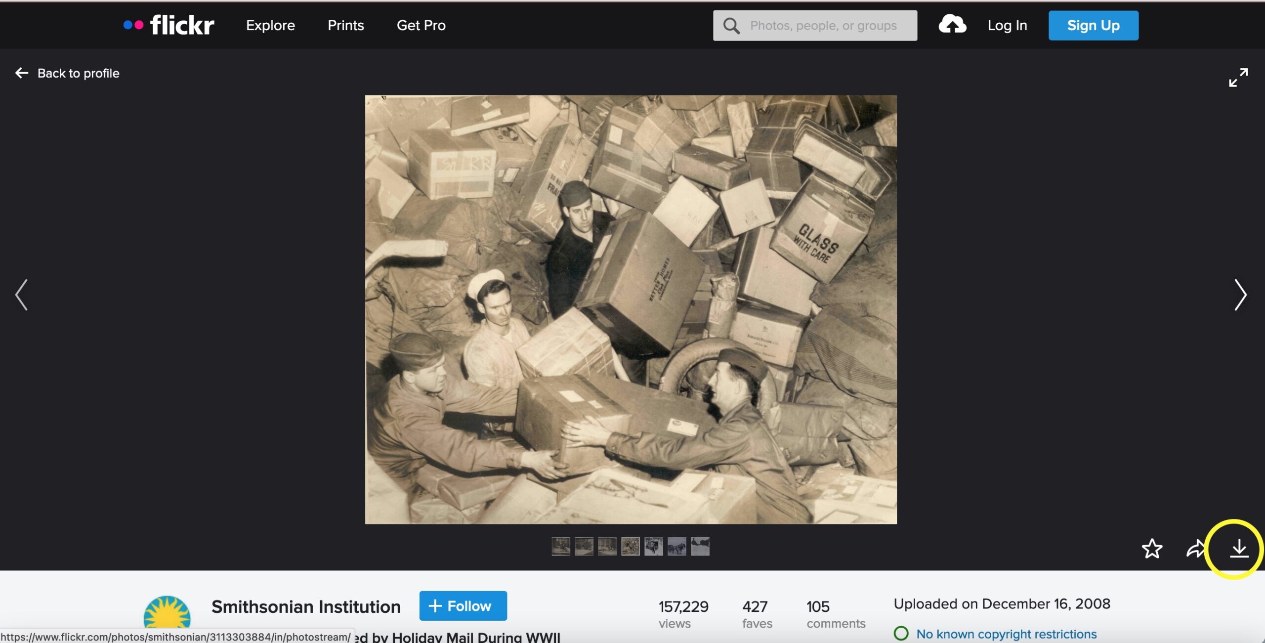
You will choose a sequence of up to five photos that tell a story visually, as a whole. The subject matter is your choice, with the limitation that you’ll be sourcing images from the Flickr collections of cultural heritage institutions (Namely: The U.S. National Archives, The Library of Congress, The Smithsonian Institution, and The New York Public Library).
- Each group will be assigned one of the above Flickr collections to work with. As a group, browse through the images, which are often contained in Albums or Galleries. You can also search within the collection: Click on Photostream, and then the magnifying glass icon. Choose a subject or theme to tell a story using images in your assigned collection. (Small and/or simple ideas will be easiest to execute within our time constraints.)
- Choose up to five images that express the story’s theme or subject. You may (but are not required to) refer to Syd Field’s Three-Act Structure or other forms of dramatic structure to help you in constructing an ordered narrative.
- Choose an evocative and/or informative title for your story. Aside from attributions, the title will be the only textual element to guide your story. Try to get the point across with the images alone in the context of your story’s title.
- Download your images and make a note of the attribution. It’s easy to download images from Flickr; simply choose a photo, click on it, and click the indicated symbol:
- Create a presentation of your story construction in Google Slides or another presentation software of your choice. Paste or insert the images you chose in the order you want them presented. Create an introductory slide with the title you’ve chosen. Upload this presentation to the Google Drive or email it to me.
- Present your story to your classmates. Share your screen, or ask me to pull up your presentation on my computer.
Week 12: Sharing/Caring/Copyright
Notice: This is just a class exercise, intended for your guidance! It’s not legal advice.
Preparation: This is a small group activity, so each student must be signed into the Zoom instance so that you can consult with your group members. This lab session will not be recorded.
To complete this assignment: We’ll briefly walk through the Copyright Flowchart and the Copyright Roulette spreadsheet I’ve created.
I’ll roll a digital die to determine the selections from each column of the spreadsheet. In your groups, you’ll confer to determine a) whether the item at hand is protected under copyright and b) how you should handle the situation. You can ask me clarifying questions!
You will have 5 minutes to come up with your answers, and then we’ll move onto the next question. When we’ve completed all the scenarios, each team will present their answers and their reasoning behind them.